
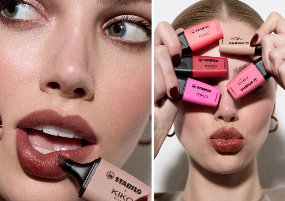
You know the Stabilo Boss highlighter. Everyone's got one rattling at the bottom of a bag. Now there's a version you put on your lips.
Stabilo teamed up with Kiko Milano and borrowed the shape of the Boss Mini for a five-colour lip collection. Same silhouette, same instantly recognisable look, totally different aisle.
The shade names are the real joke
- Fine Print (brown)
- Afterthought (mauve)
- Don't Quote Me (orange)
- On My Radar (red)
- Pink(er) (fuchsia)
Every name sounds like something you'd say while underlining a sentence. Nobody had to write a long brief to explain the idea. It's all in the packaging and the labels.
Why it works
- Both brands sell colour. This isn't a random mash-up. It's the one thing they actually have in common, so it feels obvious in hindsight.
- The packaging does the talking. You recognise the product from across the room. No logo hunting.
- Each side gets something. Kiko gets a playful new thing for the make-up bag. Stabilo gets out of the pencil case.
Stabilo is clearly playing a bigger game
This follows its Dolce & Gabbana collaboration, where highlighters wore the fashion house's signature patterns. The brand is moving from "thing you use at school" to "thing you want to own". As Group CEO Michele Molon put it, Stabilo has long helped people express themselves through colour.
The collection is rolling out in Kiko Milano stores and online across the UK, Italy, France, Spain and Germany, with selected online markets in Europe and the Middle East too.
Steal this
If your product has a shape people already recognise, you can lend it to a totally different category. Find a partner who shares your core idea (here: colour), then let the design do the explaining.